Student Design Work
University of Missouri-Kansas City
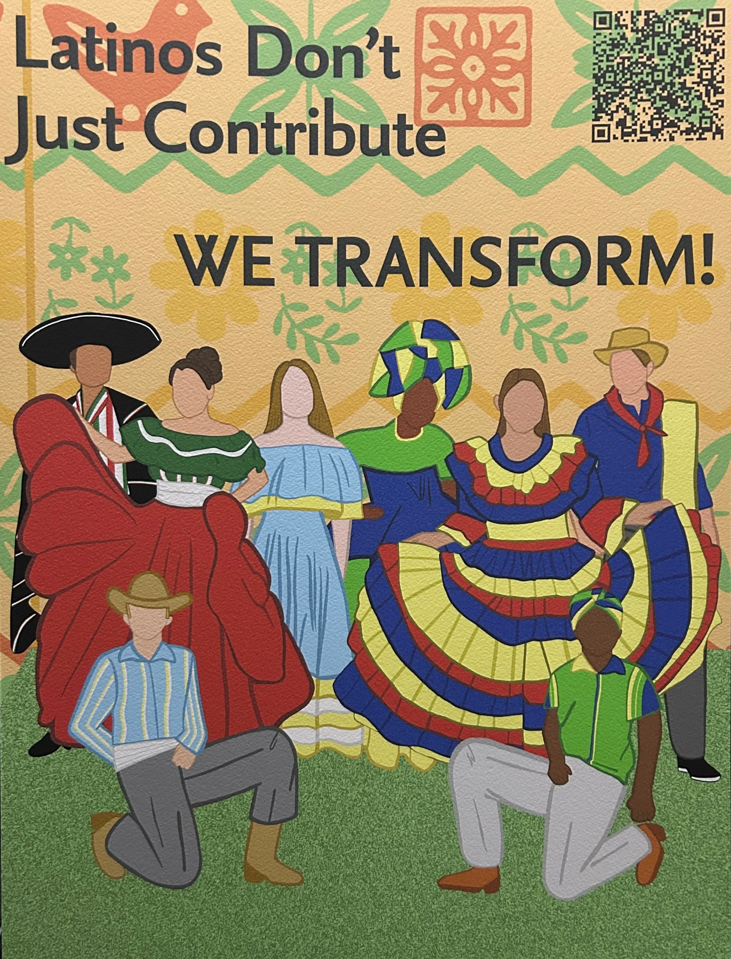
In Student Design Lab, for the Self-Initiated Creative Project, I decided to research how Latin Americans contribute to Graphic Design as a whole, from their historic days to the modern era. I represent this using four countries, which are Mexico, Argentina, Brazil, and Colombia.
This project was born from a need to push back against the discrimination Latinos face today. I wanted to highlight the power and creativity of Latino designers, specifically from our roots to our modern impact. It’s a celebration of how we don’t just contribute to graphic design—we transform it.
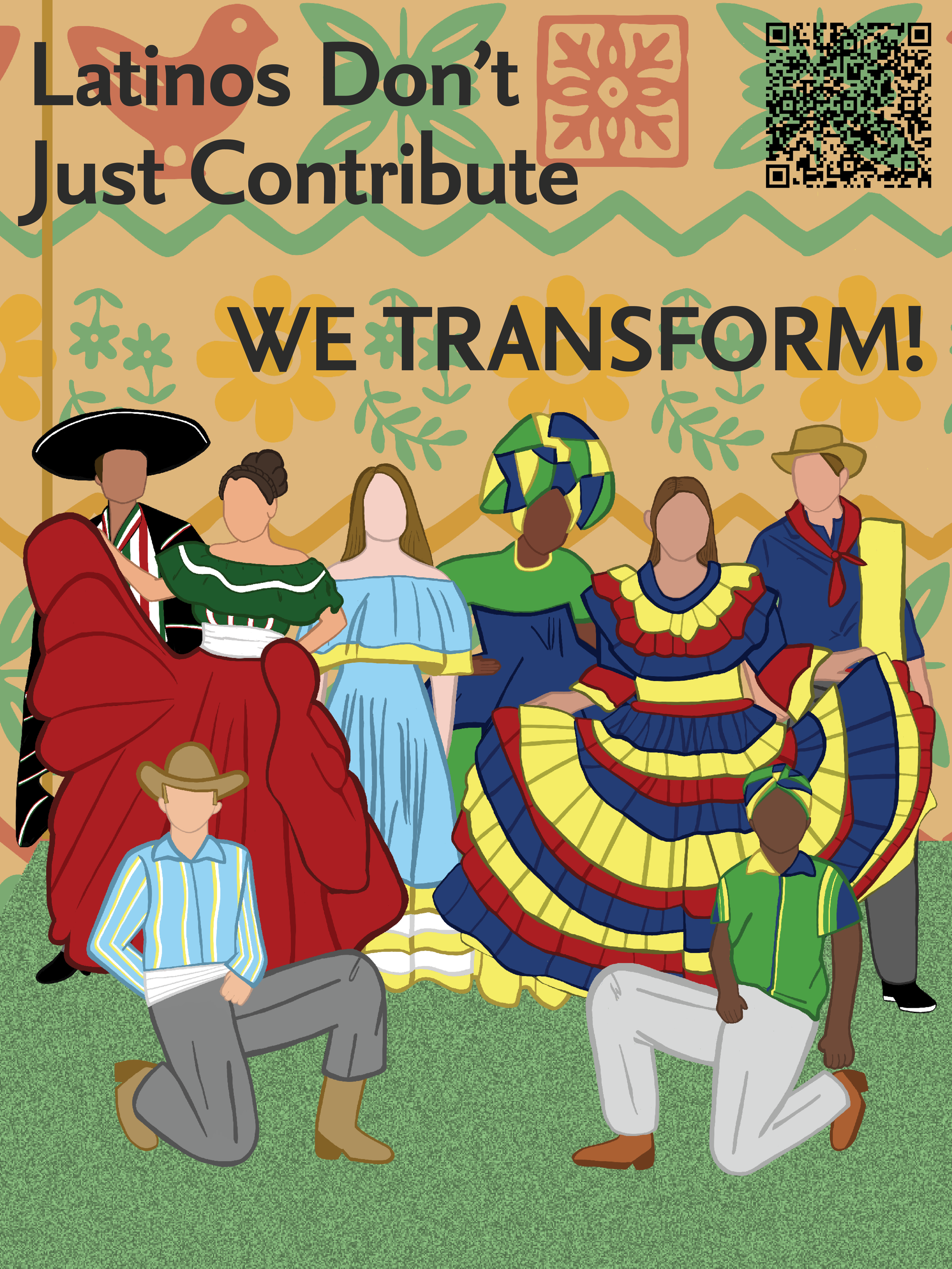
For each individual country, I named some of the influences that impacted their graphic design and made it what it is today. For Latin America as a whole, I named some of the most common factors that are found in Latin American graphic design. You can discover more detailed information using the QR code(s) above.
This poster features people in traditional attire, with a motif background and QR code made in Illustrator. The figures were illustrated in Adobe Fresco, the layout and typography done in InDesign, and historical and modern facts added in Figma to promote diversity in graphic design. The first image is the printed version, and the second is digital.
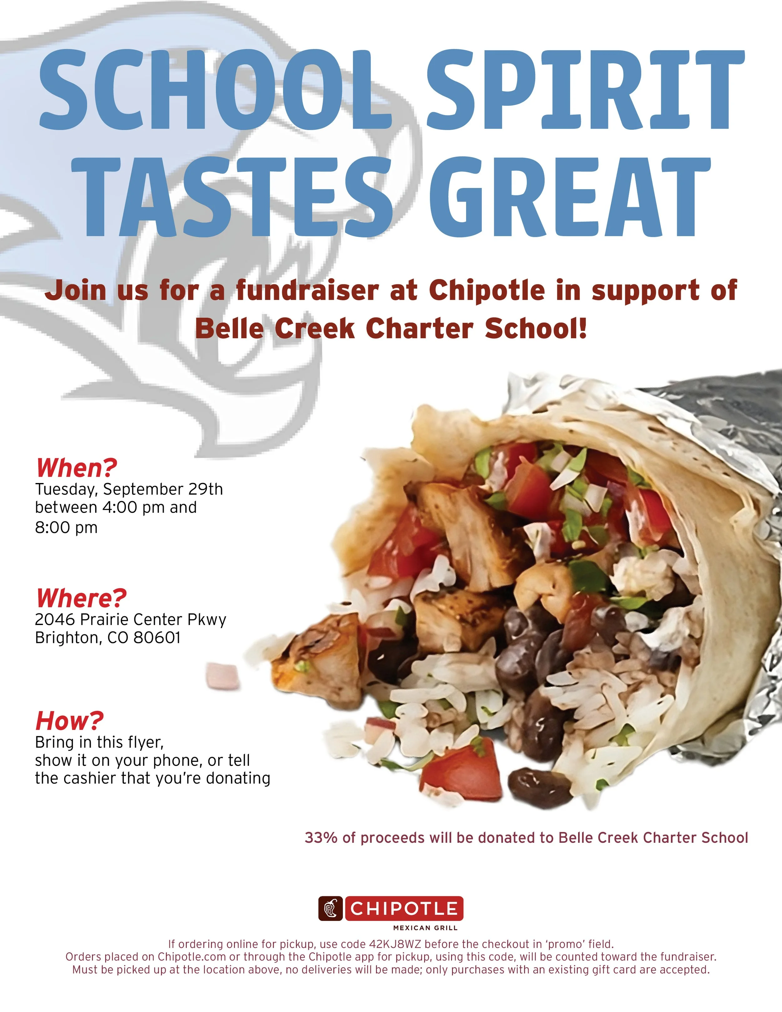
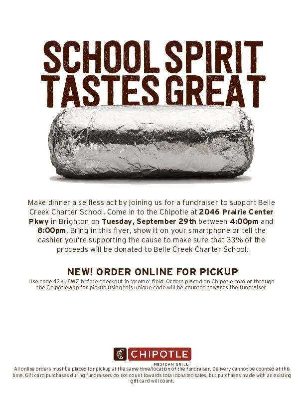
In Graphic Design II, I worked on a project called “Make it Better.” I chose a Chipotle flyer that I thought needed improvement, which is shown below.
To enhance school spirit, I added blue font and the school mascot. I also broke the informative paragraph into three sections for easier readability. I also made sure to include all of the important information, such as the proceeds, the code, and so on.
To bring life to the flyer, I added a photo of the ingredients within the burrito, which make it seem more colorful and inviting for the students and families.
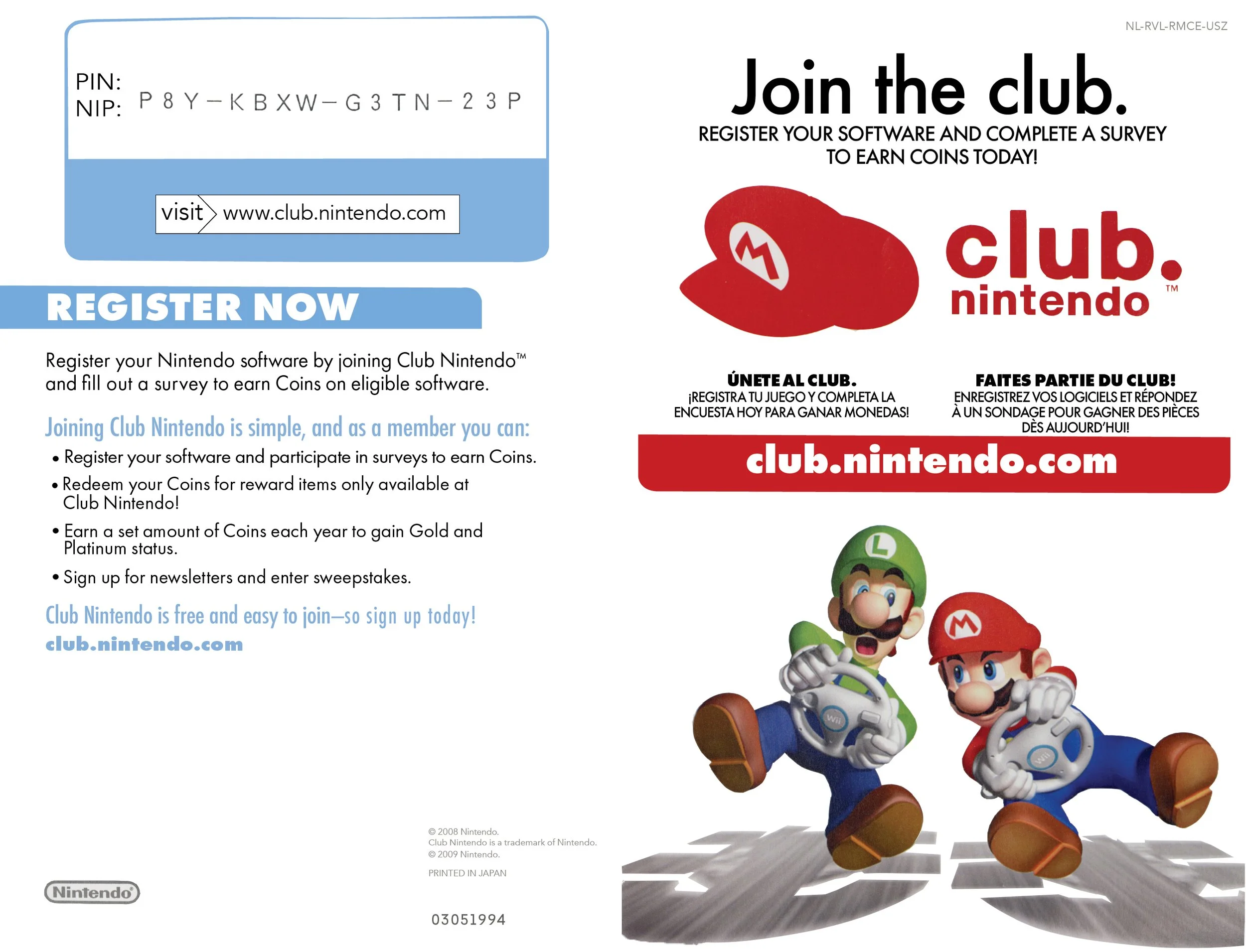
In Graphic Design II, I worked on a project named “Reverse Engineering.” For this project, I had to work backwards. I scanned the Mario Kart Wii instruction booklet and had to recreate the booklet from scratch.
First, I decided to search for most of the fonts on a font finding service named What the Font. I succeeded in finding most of them with the help of the service, and for the ones that were difficult to find or unavailable, I used an available font that was most similar to it.
I used the object selection tool as well as the quick selection tool on Photoshop to select the Mario and Luigi characters, the cap, and their shadows. It was a difficult but fun process to work backwards. I was fond of the outcome.

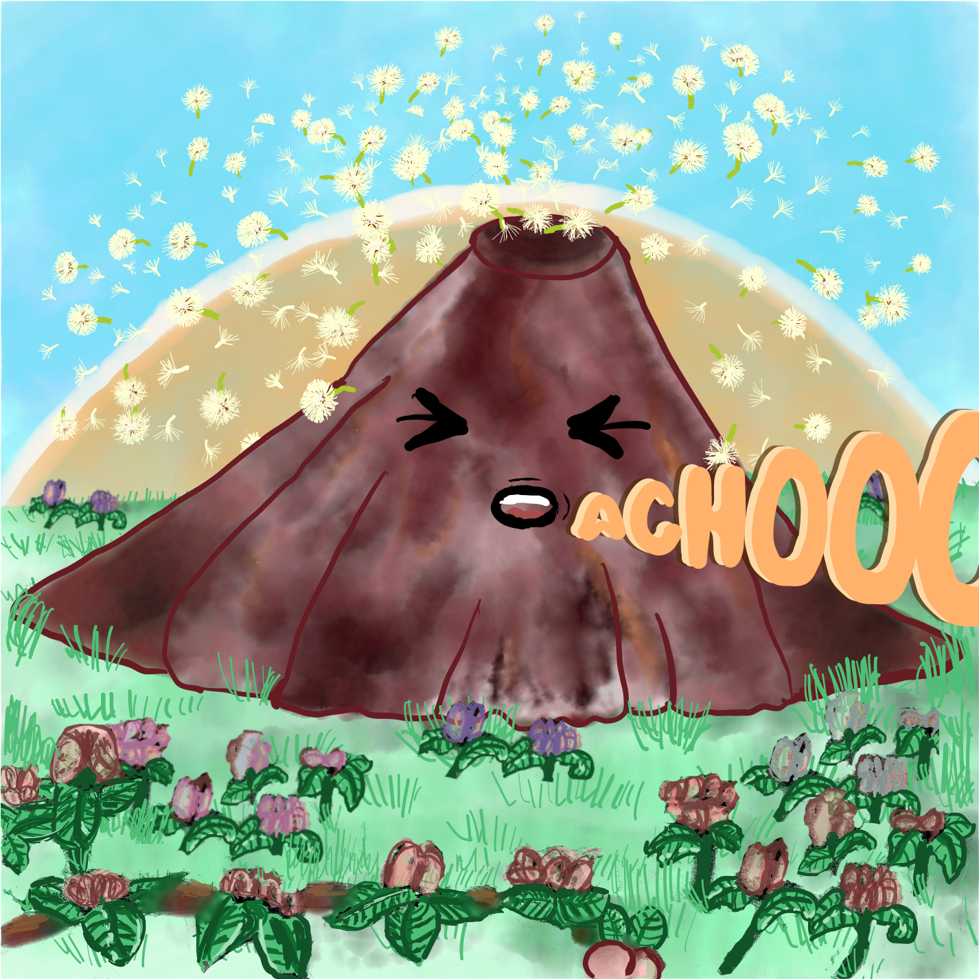

In Graphic Design I, I worked on the “Do It Yourself” project. In this project, I decided to undertake the challenge on turning something personal into something creative. I created an album front and back cover as well as a poster.
The QR codes lead to a YouTube playlist with these songs and a Spotify playlist as well.
The entire project dealt with describing my allergies during the spring season. When I am surrounded by dandelions, my sneezes are like a volcanic eruption. I feel as if dandelions have taken over and caused my allergies to worsen. So, the songs included in the album exist and all have to do with allergies and sickness during the spring.
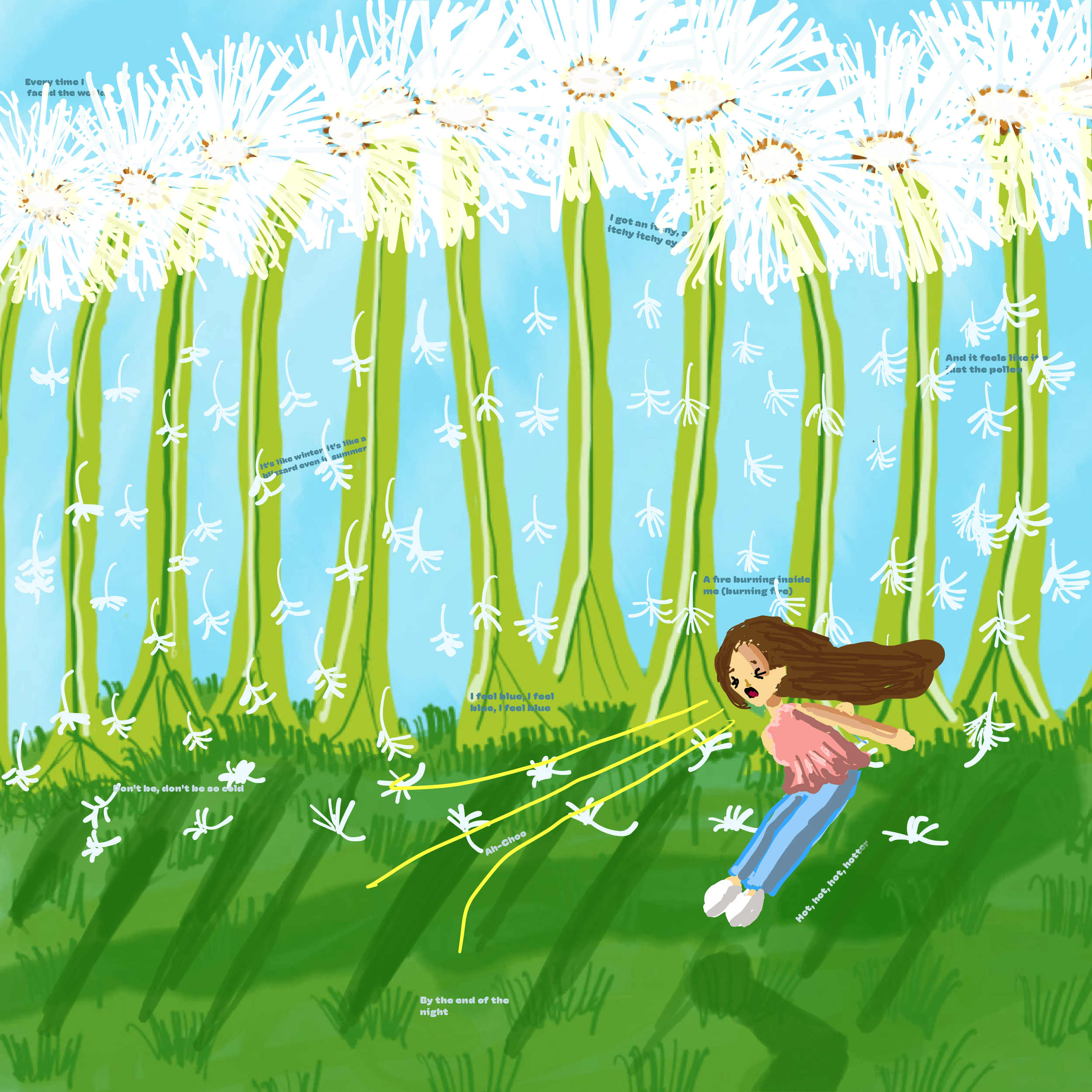
The poster includes an illustration and lyrics from each song that describe how I feel during the spring/allergy season. I advise you to zoom in.

In Graphic Design I, I worked on project 2, which was called “Learn Me Something.” This project had to be made into a zine, which is a small magazine/booklet. My zine discusses my favorite K-Pop groups, the members from those groups, and the generation they are from. I, also, discuss the history behind K-Pop, also known as Korean Pop, as a whole.
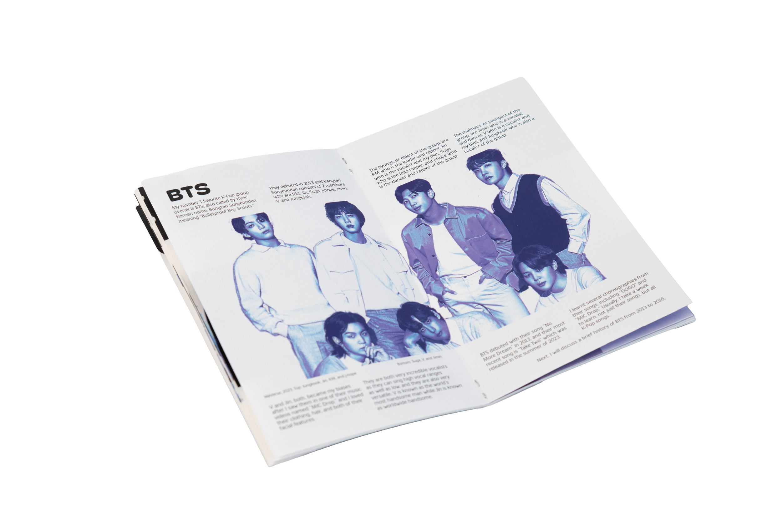
I used Photoshop to add a gradient filter onto the images of my favorite groups, such as BTS. I also used Photoshop to create the covers of the zine and formatted the text in simple but interesting ways. I also gathered information using reliable sources, such as Beyond the Story, which tells the history about BTS.

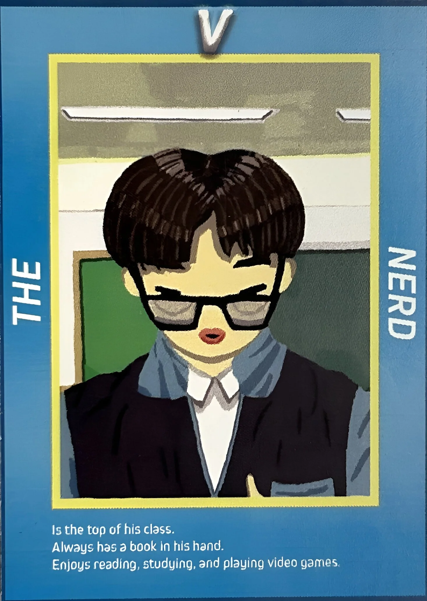
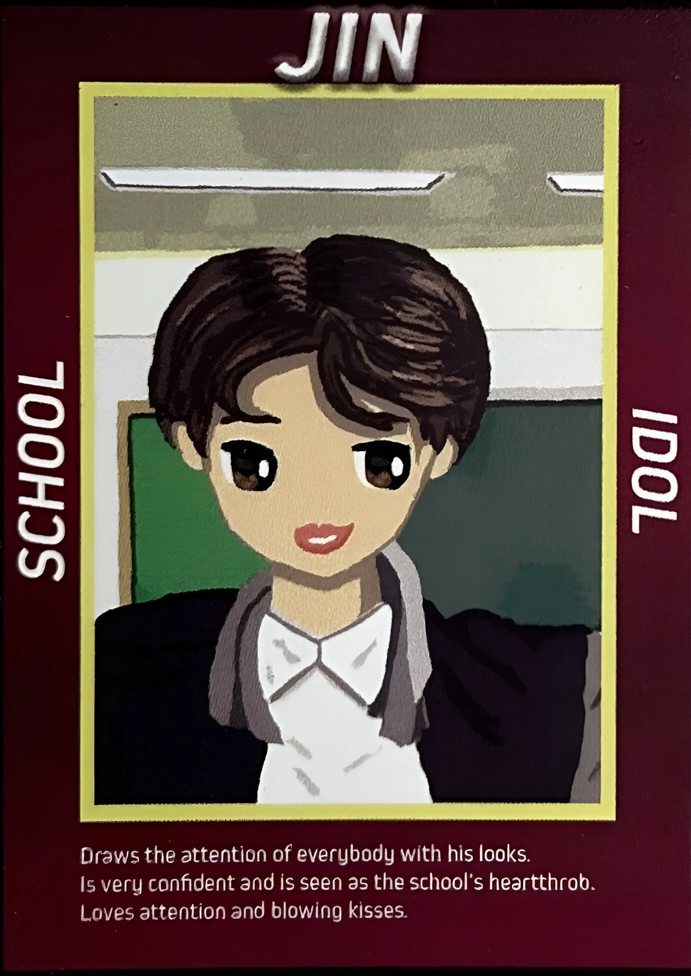

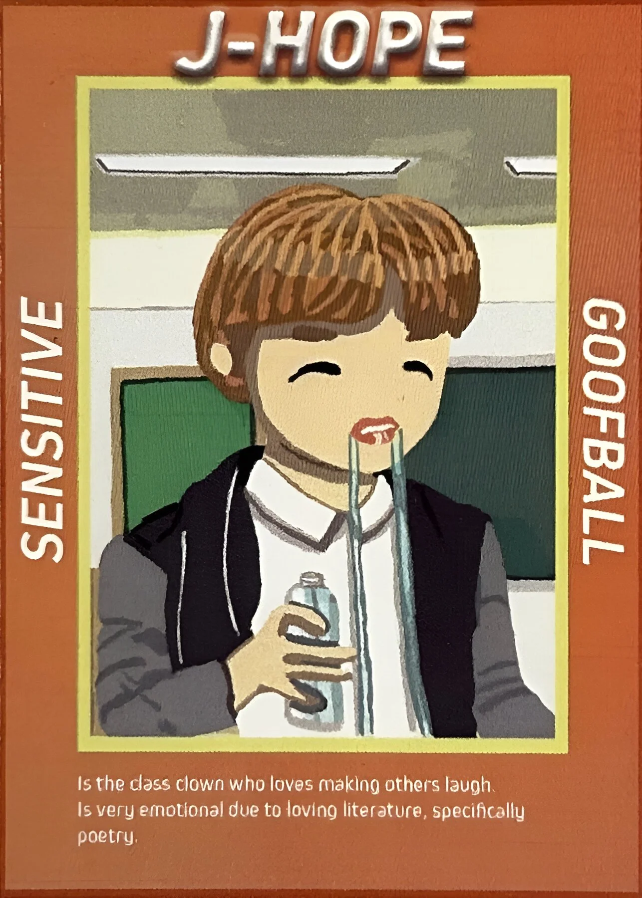
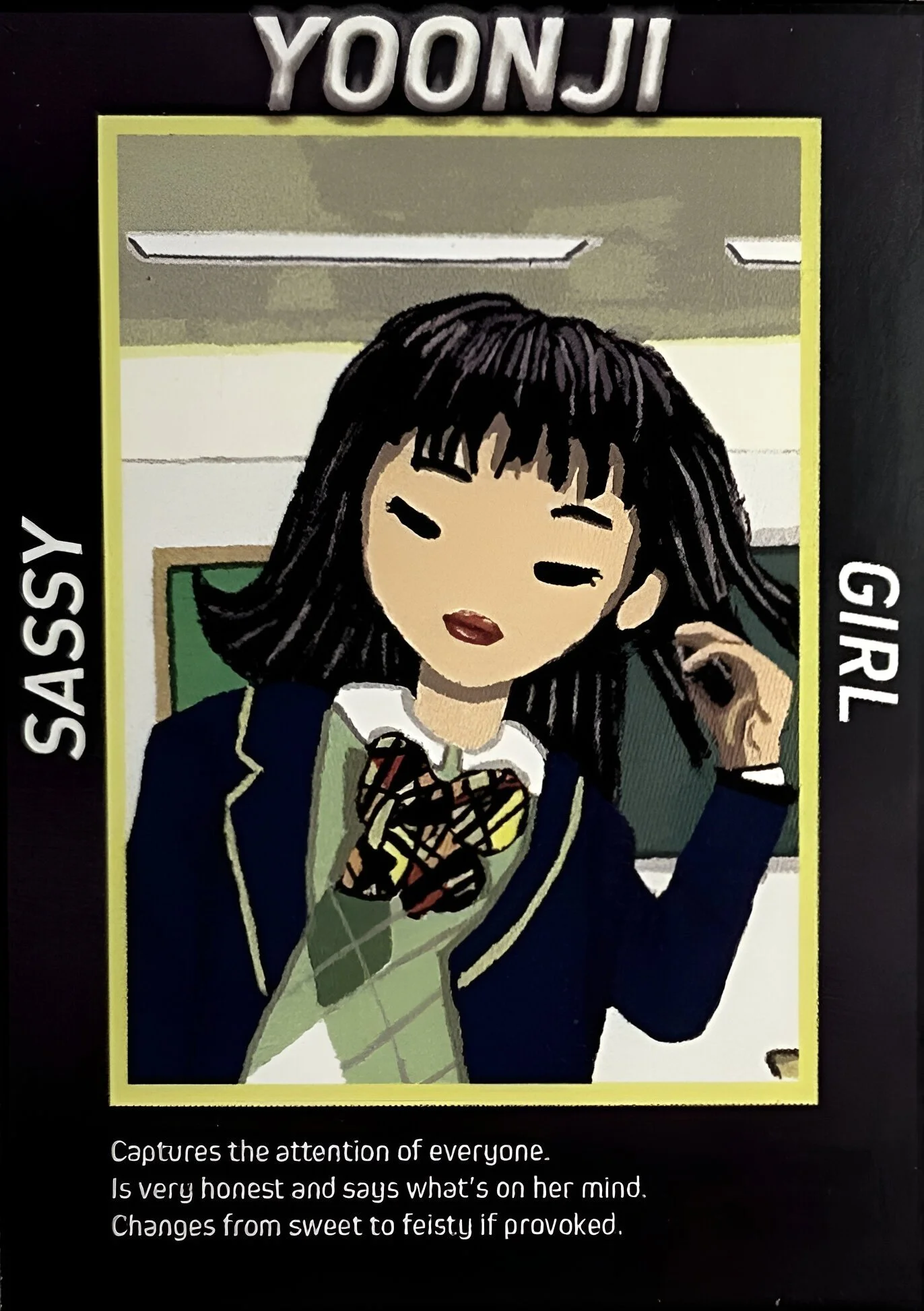

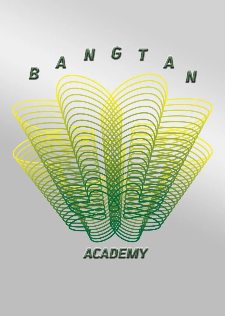
In Graphic Design II, I worked on project 1, which was another “Do it Yourself” project. I decided to create trading cards based on the different archetypes found in high school.
These illustrations are based on the Korean boy group, BTS, and a skit they did in 2017 on a web series called RUN BTS. All 7 members portrayed different archetypes.
To make these trading cards, I researched the format of a normal trading card, such as Pokémon, Yu-Gi-Oh, and based the size and manner of how to format the text on those existing ones.
The final card is the back side which contains the logo of the school/academy and it is on the backside of all 7 trading cards.
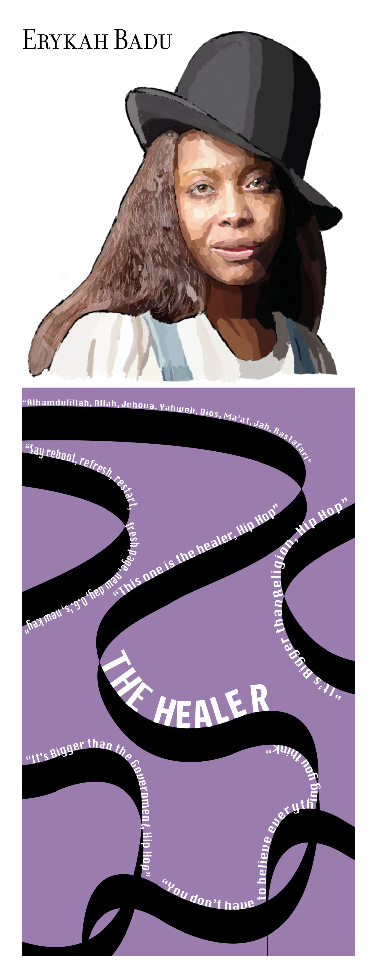
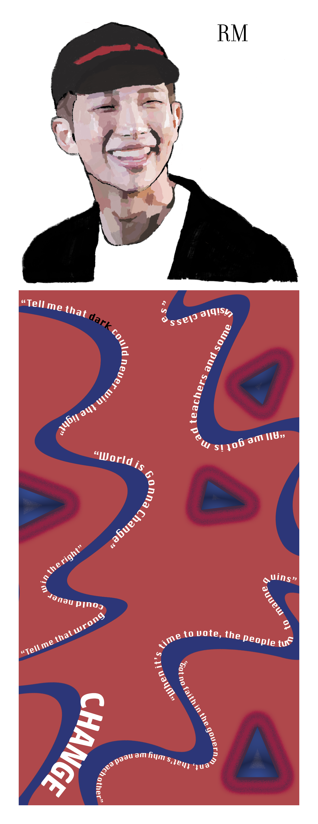


In an interdisciplinary course called Book Arts, a task was to create a handmade book based on the concept of change. I decided to base my short book on singers/artists who have sung about change or something that could change one’s life.
I picked four artists which are Erykah Badu, RM from the Korean boy group BTS, Shakira, and Sam Cooke. To implement the artists, I decided to provide their profiles and completed this using Adobe Fresco.
Afterward, I transferred these drawings to InDesign and designed the colorful backgrounds on Photoshop, and then used the Text on a path tool in InDesign to input the text. Zoom in so that you can see the lyrics closer.

Johnson County Community College

In Digital Imaging for Artists I, I had to complete “Art Project #2,” which consisted of creating a metaphoric image of a “Neverreachereland” using scanned items.
I used an orange shirt, a blanket which had elephants and swan-like animals, and a blue fabric. I used the blue fabric as the sky and the elephants as clouds. I also used the wings of the swans as flowers, which also represented clouds. The orange shirt was used as a base for the swing and as a shirt for the boy.
I used multiple tools on Photoshop, such as the blending options tools, to create the boy. Then, I used the pen tool to create the chains of swings as well as the blending options to make them three-dimensional.
This image represents a surreal and symbolic scene. A child sits on a swing, suspended in a vast, dreamlike sky with soft clouds resembling flowers and elephants. The composition suggests themes of nostalgia, imagination, and possibly longing. The swing represents childhood innocence and freedom.
In Digital Imaging for Artists I, I was asked to create two non-objective images based on a poem, which states that between living and dreaming, there is a third thing. For this project, I included scans of found text, something organic, and a scan of my choice.
As for Photoshop skills, I used distortion tools, filters, and color to convey an emotional and spatial relationship between these two images. They both work hand-in-hand with each other, although they are also the opposite from each other. Together, these two pieces seem to represent the duality of life—chaos and tranquility, movement and stillness.


The image on the left represents a sense of chaos and movement, with swirling patterns and distorted elements creating a vortex-like effect. The presence of organic shapes suggests a connection to nature, but in a surreal, dreamlike state, reflecting life's unpredictability. The distorted text and flowing visuals enhance the illusion of fluidity, symbolizing transformation, confusion, and the nature of reality.
The image on the right represents a serene, meditative quality, with an eye-like shape at the center suggesting awareness or introspection. The text and subtle figures around the edges add another layer of depth, as if there’s an unseen presence guiding this moment of calmness. It suggests that there’s balance, reflection, and peace to be found.